How to Edit Your Instagram Posts like Chris Burkard and other Colossal Photo Influencers
Basit Channa
November 9, 2022
You’ve taken a perfect picture. The angle is interesting, the exposure is just right, you found the perfect background, your subject shines. It could even be prize-worthy!
So you upload it on Instagram and excitedly wait for the pings of likes and comments to come rushing in. If the picture is promoting your business, you might find yourself hovering over the appointment book or breaking out the packing peanuts — here comes your big break!
But, you’re greeted by crickets. Not as many likes as you’d hoped and barely any comments, let alone new customers.
Why? What did you do wrong?
You’ve uploaded an unedited (i.e. dull and drab by IG standards) picture. This will not get the attention you and your photo deserve.
Those stunning Instagram feeds that get an outpouring of virtual love from IG users (and a steady stream of revenue-producing clicks, if that’s their thing) — they don’t post anything without putting it through a strict editing regimen. One can spend hours getting the right tones, correcting colors and cropping.
A great picture is made into a masterpiece by editing. However, you can master editing with just the tools I’m about to share with you. Once you know what you’re doing, Instagram’s built-in editor can do an excellent job at fine-tuning your pictures and making them truly accolade-worthy.
With photos that are vibrant, eye-catching and on-brand with their mood and message, your Instagram feed could perform on a whole new level for marketing your business.
Let’s learn how.
How to Edit Your Instagram Posts Like a Photography Pro (or a Mega-Influencer)
Editing pictures is kind of an art in itself. You can express yourself with editing tools once you understand a few basic principles.
Here what you need to know to have great pictures on Instagram:
1) Decide what you want to express with your picture first
Instagram is all about the bigger picture: a cohesive feed. Before editing your picture, think about the overall tone of your IG feed and how this will fit in.
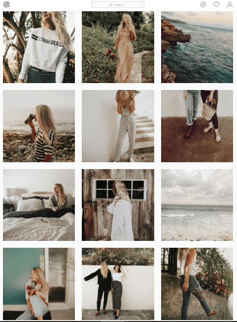
For example, Hannah Rose has a gorgeous vintage feed, so each picture has to keep those gorgeous warm, antique, faded tones in mind.
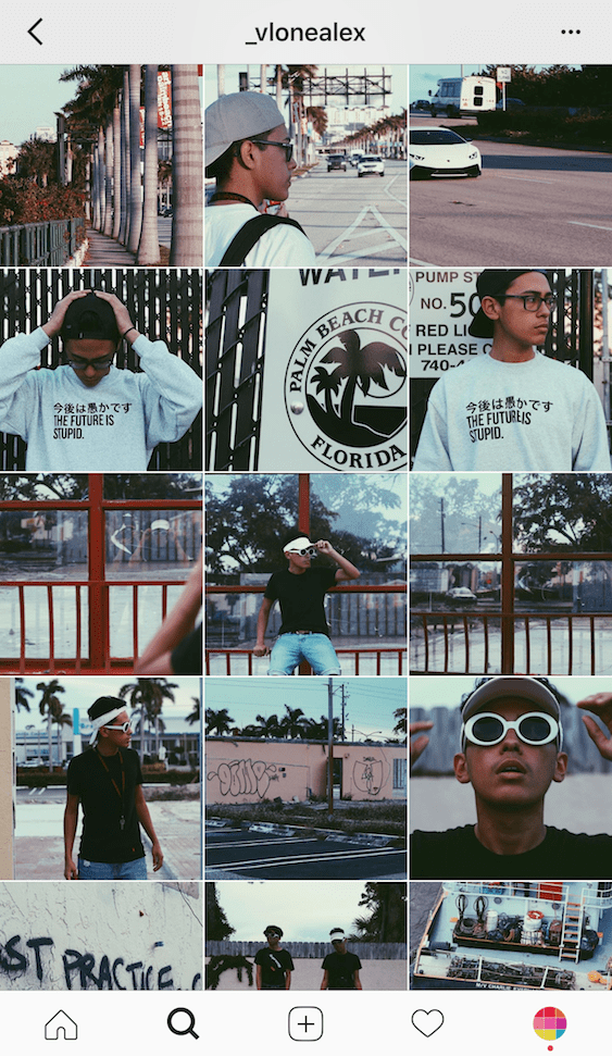
On the other hand, here’s a dark, moody feed with a bluish-gray tinge throughout.
Bold and vibrant pictures generally always look good and give your feed a professional, luxury look. So if you’ve taken an underexposed picture or your white balance was off and the picture came dull, tweak the brightness till it’s good and light.
However, if you’re going for a moody, vintage or similar vibe, you can forego brightness.
Finding Instagram Influencers is a pain in the behind!
Let us do it for you, with this exclusive offer.
For just $7 we’ll send you a custom list of 30 micro-influencers in categories such as:
Automotive
Beauty/Skincare
Cannabis
Fashion/Apparel
Fitness
Food & Beverage
Golf
Guns
Pets
Photographer/General
Swimwear
Travel
Other
If you’re serious about leveraging Instagram influencers to grow your business, you’d be crazy not to take us up on this.
Each list is customized to your exact requirements. Yes, we actually have a real human being go on Instagram and dig around for these people!
At only $7, it’s a tiny investment that will save you hours of work. So get it now while you can:
This should be elementary by now, but uploading a dull picture on Instagram is the quickest way to lose followers.
You might take a sharp-ish picture on your smartphone, only to find out that on the computer it loses crispness. This can easily be corrected while editing: you can sharpen and increase the contrast for a little added drama. Play around with structure and sharpen tools on Instagram’s in-built editor (more on this down below) to give your picture nice clean lines and good contrast.
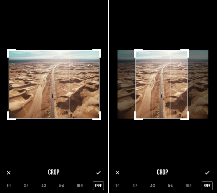
Think cropping your picture is a waste of time? Think again.
Cropping is the best way to clean up your image — you can eliminate any distracting elements in your picture, get its alignment right with rotation, and bring all the attention to your subject. Instagram has an easy crop option to upload a rectangular version of your image for added interest.
5) Don’t be afraid to re-edit an image until it looks right on different screens.
You can save edited images as drafts on Instagram and come back to them later to re-edit. Don’t be afraid to use this till you’re happy with the edited image.
You can also email a draft to yourself and open it up on your computer to see how it looks on the big screen. Sometimes colors can be a little different when viewed on the web version of Instagram, so make sure your picture looks great on the app and on web before you upload it.
Become a Jumper Media Insider
You’ll get weekly motivation and first dibs on exclusive giveaways and other subscriber-only resources you can’t get anywhere else.
Edit Awesome Photos with Instagram’s Built-in Features
It’s official: A picture that isn’t edited (polished, sharp and shiny) is just not good enough for Instagram.
You don’t need complicated editing software (and the technical skills to use it) in order to edit your photos like a professional.
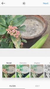
Instagram’s built-in editor is super-easy and quick to use, powerful enough for most needs, constantly being updated with better features, and FREE. There are multiple filters to start you off easy, and other advanced editing tools you can use to tweak your images to perfection.
Filters
I can’t believe only 10.5% Instagram users use filters. The other 89.5% are missing out big time!
Instagram filters can be an amazing one-stop photo fix by themselves for the novice or lazy editor, or a starting point for more advanced treatments. You can play around with different filters, tone down the filter intensity, and then further amp up your image with individual editing tools.
Once you get a combination of filters + other editing tweaks that you love, you can use the same settings on all your pictures for a cohesive feed.
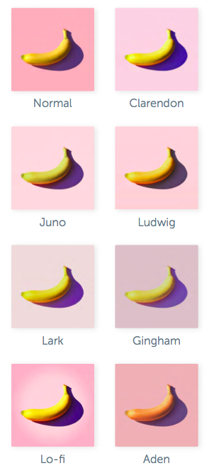
Did you know there are 40 different filters you can play around with?
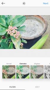
1) Clarendon
According to Canva, Clarendon is the most popular filter among American Instagram users. It instantly brightens and intensifies color, which is probably why it’s super-popular. (Being the first entry in the filter bar doesn’t hurt with popularity, either!) Notice how it lightens up the light areas, and intensifies the darker ones, creating a more vibrant image.
If you want a clean, bright look for your Instagram feed, this is your go-to filter.
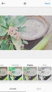
2) Gingham
Gingham is the second most popular filter, and a favorite amongst those who love nostalgia-evoking pictures with an old-school vibe. The colors are muted and soft.
If you’re going for a vintage vibe, this filter works great.
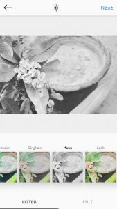
3) Moon
Monochromatic color scheme with a touch of vintage? Moon it is.
Fun fact: It was named after an Instagram team member’s dog.
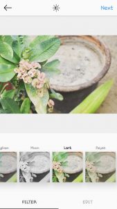
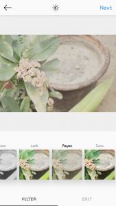
4) Lark
Lark intensifies all the colors in the picture and brightens it up, while desaturating red. Look at how the pink flowers have lost their color, while the leaves are greener and warmer.
5) Reyes
Reyes gives a dusty, old-school look to images. The colors are a lot more softer and faded than Gingham.
6) Juno
Notice how Juno gave these leaves a scrumptious, vibrant green color and made the brown of the pot a lot richer. This is exactly what it does: it gives a green tint to most cool shades and intensifies the warm tones. It makes pictures pop.
Another great option if you like vibrant, bright images.
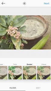
7) Slumber
Slumber brings retro-vibes and enhances warm shades in your picture. Get that instant-camera look in your images with Slumber.
8) Crema
Crema softens up colors and smooths texture. It works great for gorgeous nature-scapes and gives them a dreamy, romantic look.
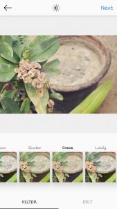
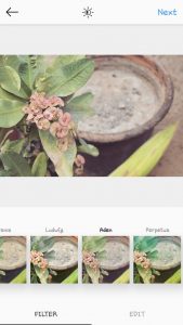
9) Ludwig
Ludwig highlights white light and desaturates almost all colors. It provides a great starting point to photo editors, they can easily build on this filter using other editing options.
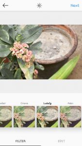
10) Aden
Aden is another great filter for vintage lovers who like dreamy pictures. It gives a warm, rosy tinge to pictures.
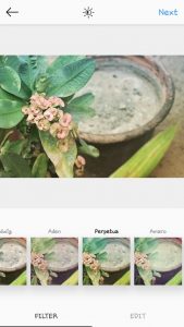
11) Perpetua
This wins Best Filter for Lazy IG Users – it instantly brightens and sharpens up a picture, giving a slight bluish tinge.
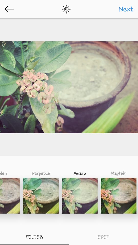
Amaro gives images almost an aged, film-like effect by simulating increased exposure. It’s a gorgeous filter that adds drama to images.
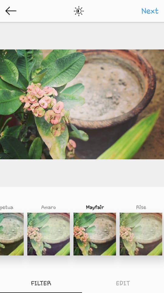
13) Mayfair
Mayfair is one of the easiest filters to work with. And it’s not just me who thinks that.
Instagram reports that images using this filter receive more interactions than average. According to Instagram, the Mayfair filter creates, “a warm pink tone, subtle vignetting that brightens the center of the photograph, and a thin black border.”
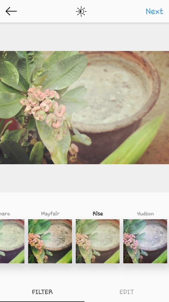
14) Rise
Rise gives a warm yellow tinge to images while smoothing out imperfections and texture. It also lightens up underexposed pictures, so if you’re working with a dark image, try using this.
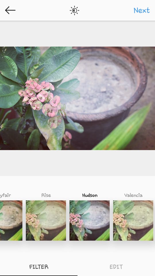
15) Hudson
Where Rise made images warmer and more yellow, Hudson does the opposite and makes images more cool-toned, giving them a blue tinge.
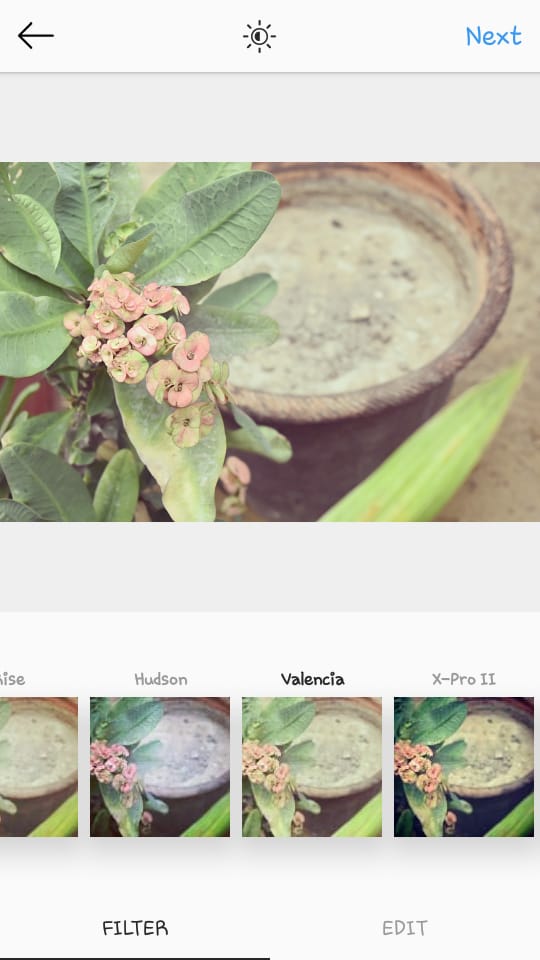
16) Valencia
Valencia is a beautiful filter that makes images softer and dreamier. It intensifies dark and dull colors, while amping up exposure. According to Canva, it’s the number one filter choice for nature and landscape photographers.
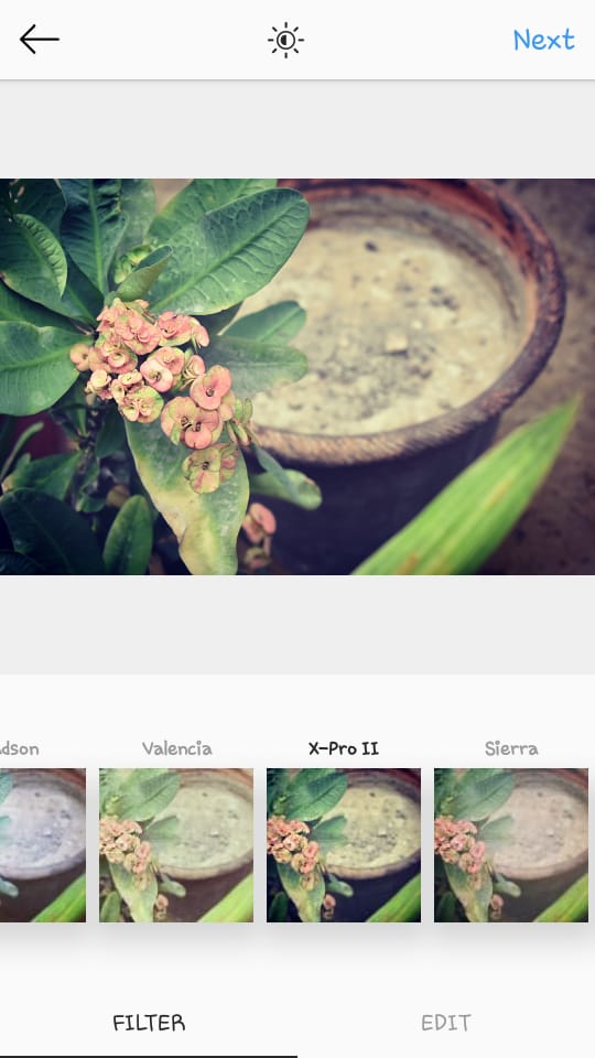
17) X-Pro II
X-Pro II adds a ton of shadows and darkness, and a thick black vignette border. It’s one of the oldest and most popular instagram filters. It instantly gives even mediocre pictures more intensity and drama.
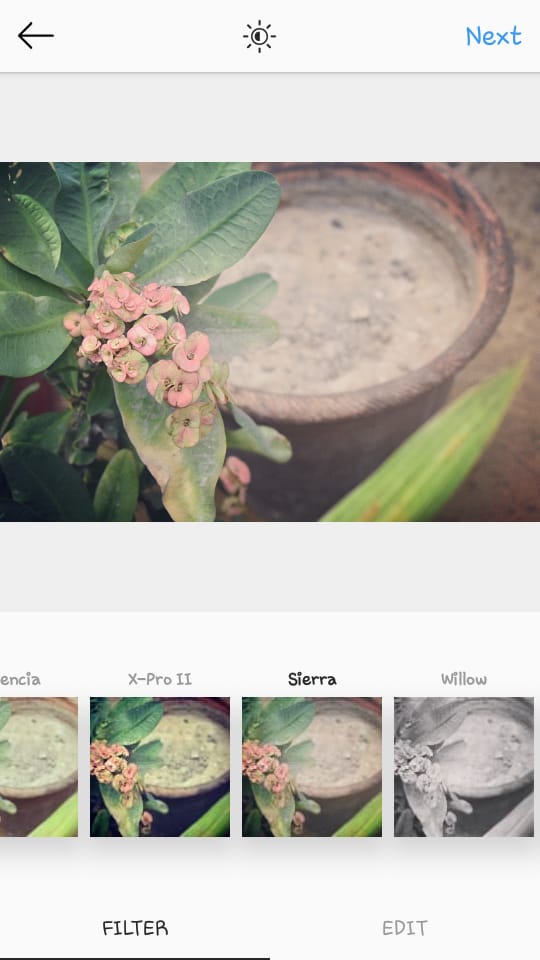
18) Sierra
Coupled with a faded, age-old look and a thick vignette border, Sierra is a great choice for vintage lovers. According to Canva’s Instagram filter report, Sierra ranks number three of the world’s favorite and most-used filters.
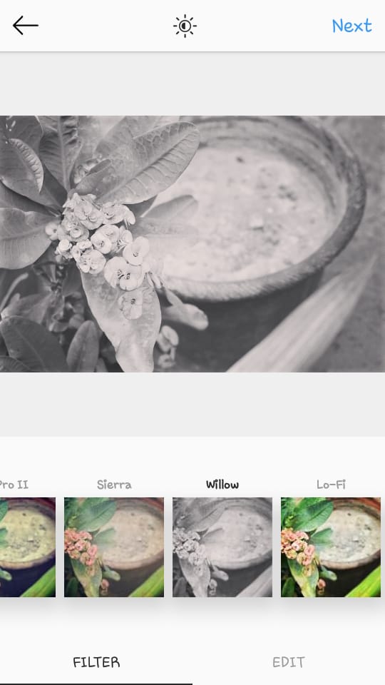
19) Willow
Willow gives your picture a subtle, classy, almost vintage-looking monochromatic look. Use it well.
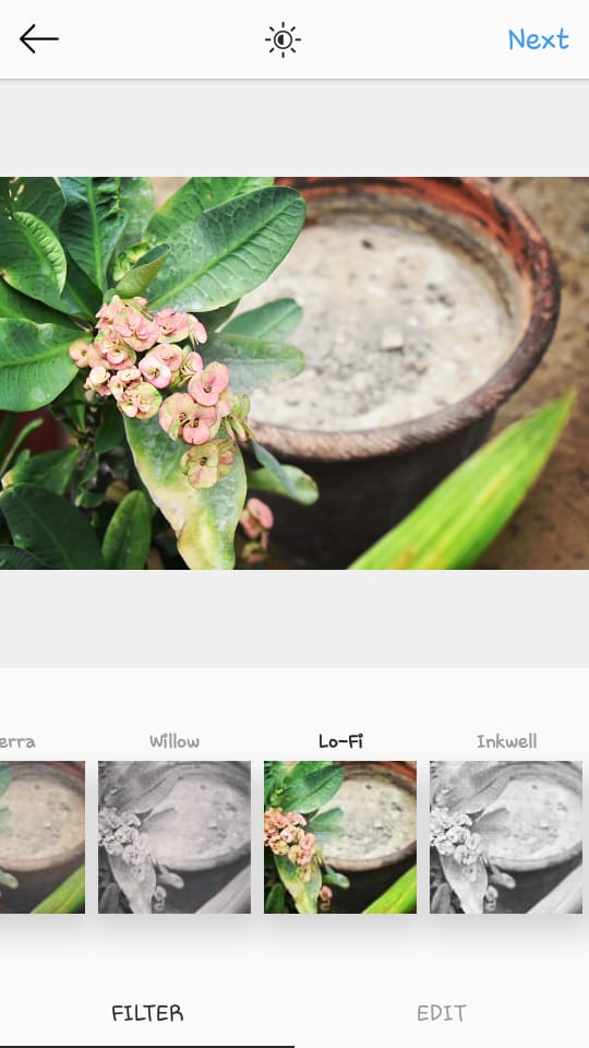
20) Lo-fi
Lo-fi is one of the brightest filter options on Instagram. It makes your shadows darker and your lights brighter, while enhancing all the colors in the image. Result? An instantly brighter, more vibrant picture.
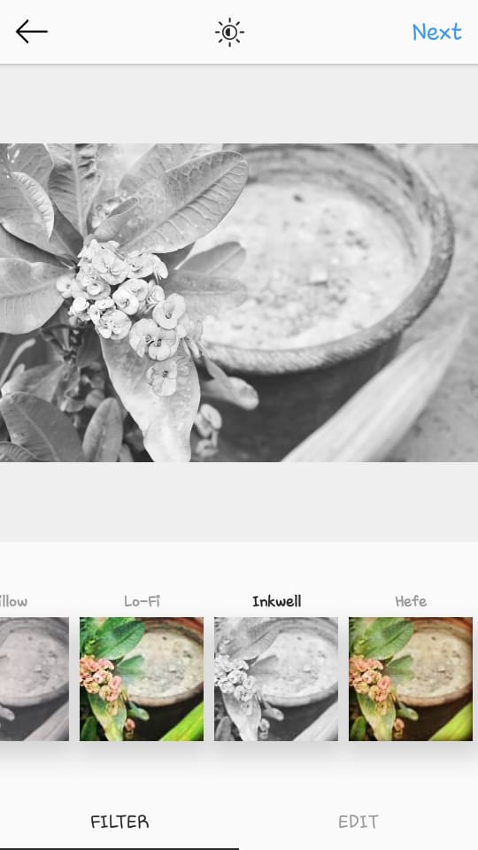
21) Inkwell
A basic black and white filter, like the little black dress that everyone needs in their Instagram-life.
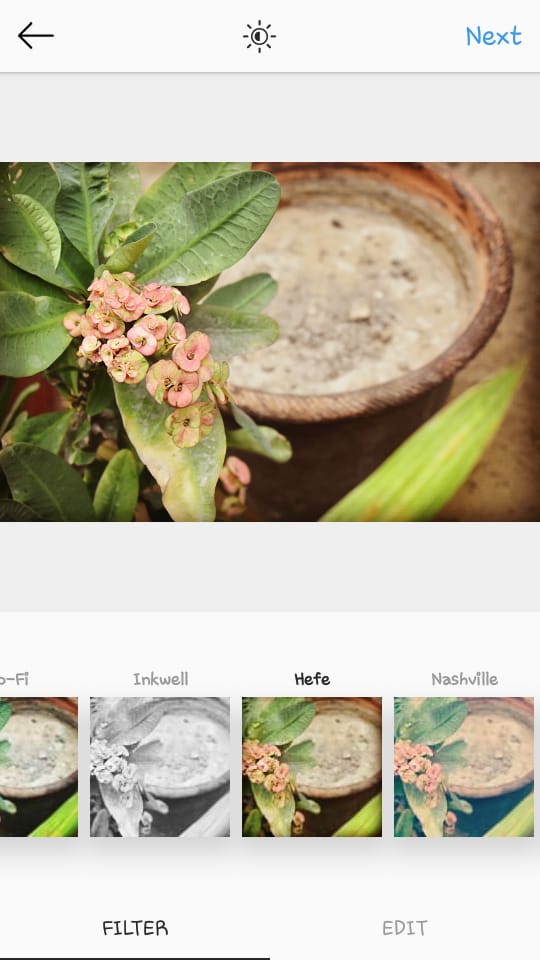
22) Hefe
Another bright filter with a yellow-golden tinge and vignette borders.
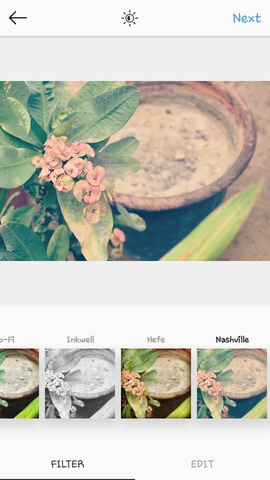
23) Nashville
Nashville gives pictures a pastel pink tinge with vintage vibes. Sweet tea, anyone?
You won’t find the filters mentioned below on Instagram default filter tab. But don’t panic, they’re in there.
Click ‘Manage,’ which appears after Nashville (usually), and there you’ll find the rest of the filters. Check all the filters that are unchecked and they’ll appear in your filters tab instantly.
Stinson
Vesper
Earlybird
Brannon
Sutro
Toaster
Walden
1977
Kelvin
Maven
Ginza
Skyline
Dogpatch
Brooklyn
Helena
Brannon
Ashby
Charmes
More Editing Tips, Tricks, and Hacks to Jazz Up Your Instagram Posts
Ever heard of Cole Rise?
No? Well, he’s the reason why Instagram’s filters are so popular in the digital world. He not only created Instagram’s icon, but was also responsible for creating seven popular Instagram filters: Amaro, Hudson, Sierra, Sutro, Mayfair, Willow, and Rise.
According to him, don’t overuse and abuse filters, instead be subtle and light-handed with them.
Having made many of the original filters for Instagram, I realised that subtly is key. It’s really important when taking photos not just to look at today, but think about what it’s going to look like tomorrow. – Cole Rise
And while we’re at it, here are a few other tips to help you use filters to their fullest.
Manage filters by moving favorite filters on the top
Have a couple of favorite filters? Click on ‘manage’ and move your favorite filters to the top. You can also toggle filters off that you don’t like to make your filter tab clutter-free.
Use filters on top of filters on top of filters
Play around with filters. If you use one filter and think, ‘Hmm, something’s missing,’ try adding another filter to the image, then tweak the filter intensity and see what works. Keep experimenting and playing around until you get your perfect filter combination.
Play with filter intensity
Rise says himself, “I have a rule when I edit a photo, I slide everything down to 50% and see how it looks. I try and bring it back as close to the original as possible and build up from there to find that middle ground.”
Use filter thumbnails to quickly shortlist filters that work for your image
When you’re just starting out, choosing the right filter can get quite confusing and frustrating. So click on Manage and see how each filter makes your image look in the thumbnails. Toggle filters off that you don’t like, and you’ve got a shortlist of ones that could work.
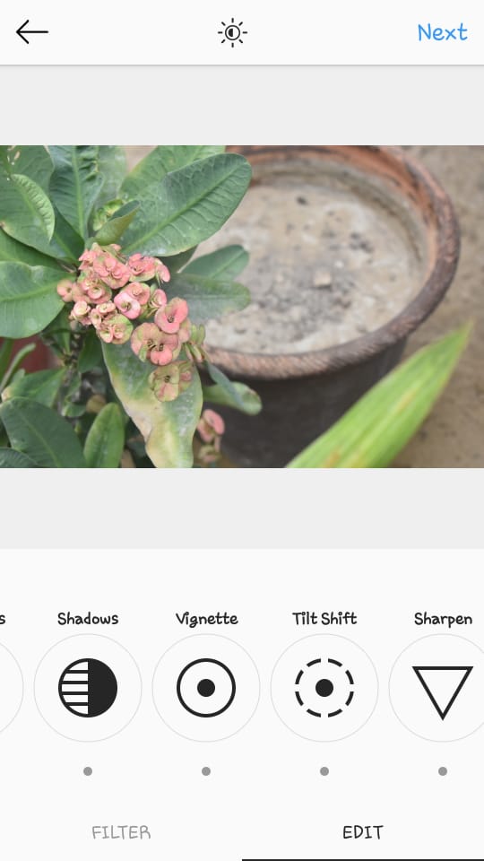
Use Edit Tools for Added Oomph
Now that you’ve played around with a couple of different filters and applied these to your images, what’s next? Edit some more!
Actually, consider these completely optional, but Instagram’s editor provides you with different editing options to further enhance your image.
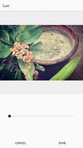
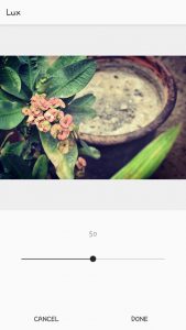
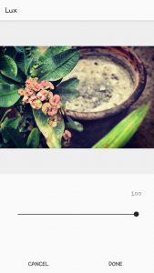
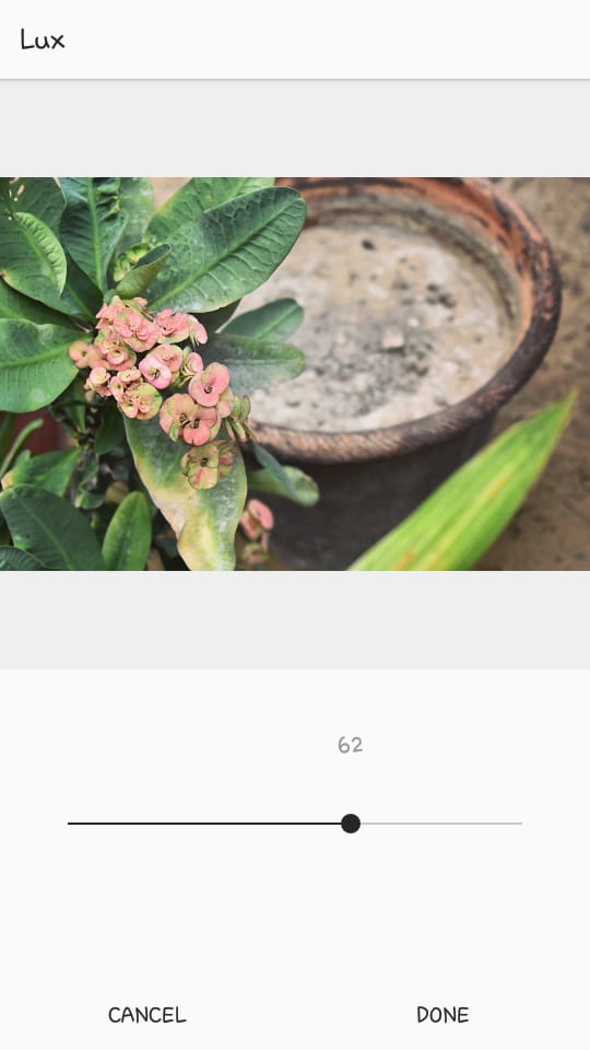
Start off with Lux
You’ll see a small sun icon at the top of the screen. This is the Lux icon that sets the exposure of the picture and adds shadows and highlights.
It’s a fun way to modify your picture and give it contrast. Drag the slider right to increase contrast, definition and shadow, and left to decrease them.
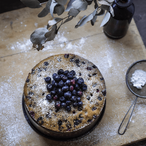
I chose the filter Mayfair, and decided to increase the lux setting slightly so the leaves look scrumptious, greener and more prominent.
Check alignment
Now once you’ve got the filter intensity and Lux setting right, check the alignment of your image. If it’s slightly crooked, you can rotate it. If there are too many distracting elements in the image, crop it so that it’s just right.
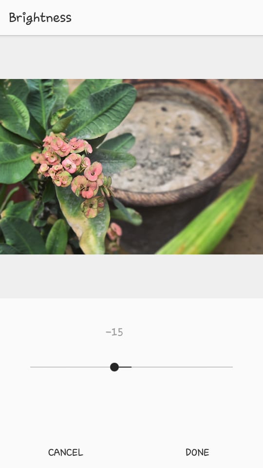
Tweak other editing tools
Next, we’re onto my favorite part — using editing tools to make the image just perfect.
Instagram has the following editing options available:
Adjust: For perfect alignment.
Brightness: To lighten up your image and increase the exposure.
Contrast: To make the shadows darker and light areas brighter. Increase or decrease depending on the kind of effect you need.
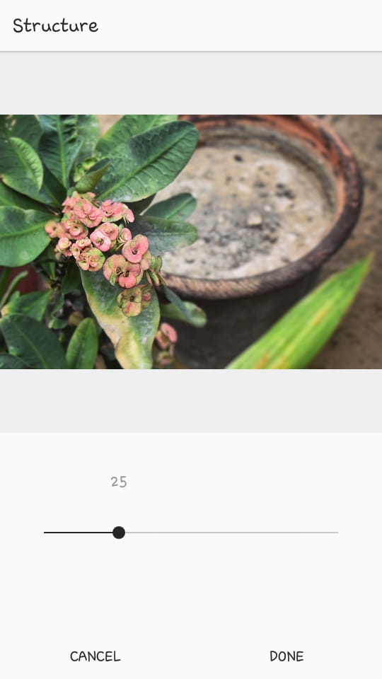
Structure: Make the image crisper or decrease the sharpness and make it smoother.
Warmth: Add a yellow-gold tinge to your images.
Saturation: Increase or decrease the color intensity.
Color: Add different colored tinges to your image. It’s like adding a transparent layer on top of your image.
Fade: Decrease the colors in your image.
Highlight: Add light to the image, or remove it.
Shadows: Add shadows to dark areas in the image, or remove them.
Vignette: Add a translucent black border around the image.
Tilt shift: Bring your subject into better focus using either the radial or the linear option.
Sharpen: Crisp up the details in your image.
For our example image, I’m going to slightly decrease the brightness.
I increased the Structure to 25 to make the leaf veins a little more prominent.
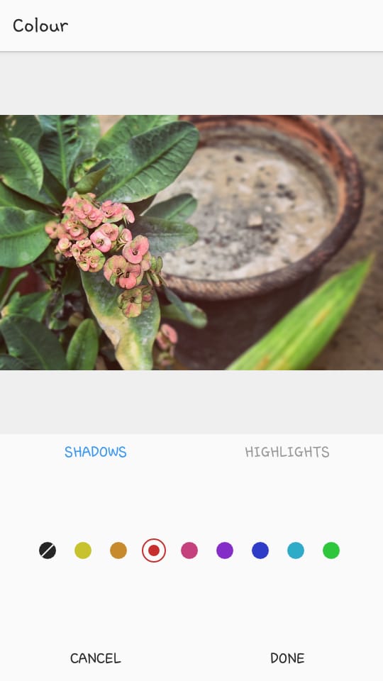
I added a rosy tinge to my image through ‘Color.’ I’ve also decreased the intensity of shadows and highlights in this tool, to just get a hint of rosiness.
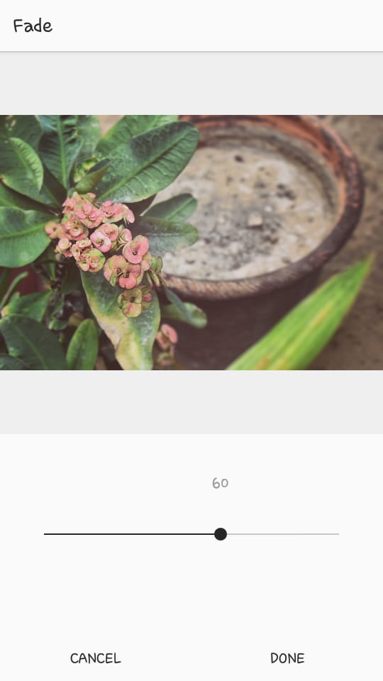
I increased ‘Fade’ to 60 for some vintage vibes.
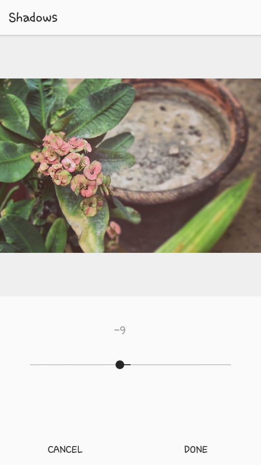
Let’s decrease the shadows slightly.
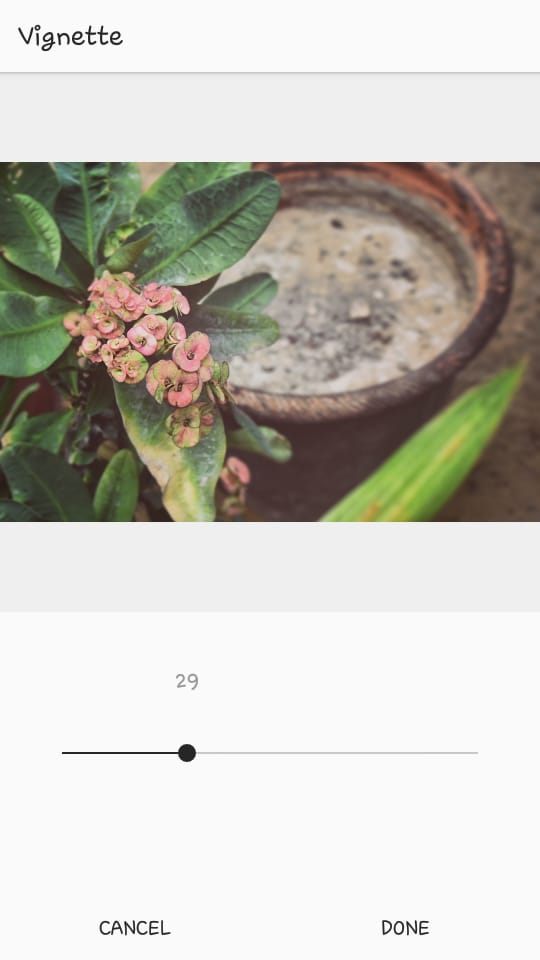
Next, I added a bit of a vignette to make the subject more prominent.
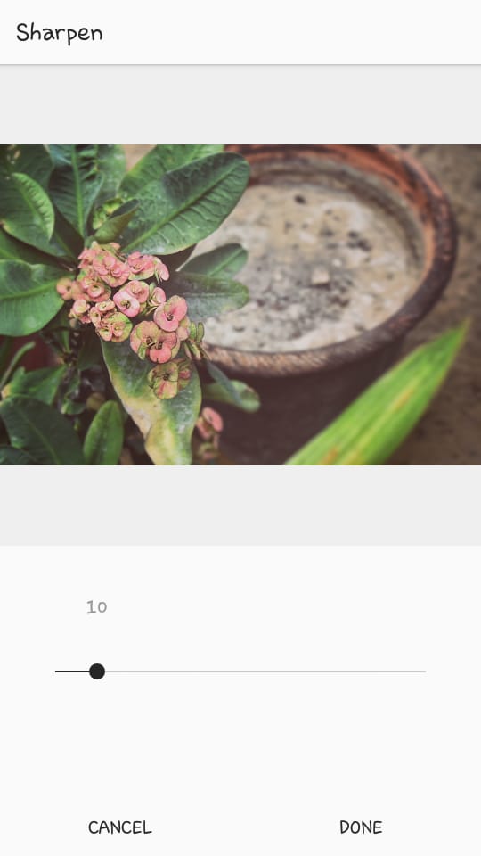
And sharpened it just a tad.
Here’s the final before and after. This is nothing too dramatic, but it’s exactly what I wanted.
From this,
to this,
Remember, what works for me may not necessarily work for you. So just play around with different editing options and you can get the image exactly as you envisioned.
Before you get too carried away with this plethora of editing options, remember that you only want to enhance your image, not completely change it.
Good Editing -> Better Pictures -> More IG success -> Happiness?
Instagram usage has doubled in the last two years, and it’s going to rise more in the coming year. The way to compete with others on this platform and use it to advance your brand is by posting pictures that transfix your audience. It’s a purely visual platform, so bring your brand’s best visual foot forward.
My bottom line? Take a great picture, edit it ‘till it shines, and upload. Simple.
What’s your favorite way to view the world — bright and crisp, moody and gritty or vintage and rosy?
Remember the days when your feed was filled with perfectly curated, heavily filtered posts? Well, with the platform’s recent update, those days might be coming…
Colton Bollinger
Jumper Media is a Google Ads Partner. Google Maps ranking and SEO services are not endorsed, verified, or guaranteed by Google.