A smart Facebook ad campaign can make your business stand out on social media even if your information is getting lost in page after page of Google results. If you’re in a popular industry, your Google listing can get buried in the masses; on Facebook, it can be a powerful standalone offer.

When designing an ad, you’ll usually consider your copy, your visuals and their layout – but also key is how your words look to the viewer. There’s a texture to text, and the length and word choice of your copy play a role in the overall design of an ad.
When it works, your target audience will feel “called” to act, whether that’s to engage with your post, visit your website, sign up for your newsletter or buy a product.
Using an understanding of Facebook advertising benchmarks, you can create the best calls-to-action (CTAs) for your Facebook ads.
The Relationship Between Facebook Ads and CTAs
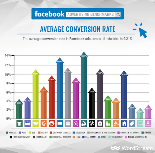
WordStream has an excellent chart with the average click-through rate (CTR) for 17 industries on Facebook, which we can use to highlight different advertising strategies.
The top-performing industries are legal, retail and apparel, followed by beauty, technology and fitness. The three lowest-performing industries are employment & job training, finance & insurance, and customer services.
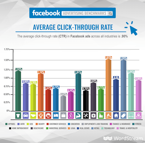
Retail, apparel, beauty and fitness ads may perform so well because they often feature attractive models and quality images, and both Facebook and Instagram (which is owned by Facebook and shares an ad platform) are visual in nature.
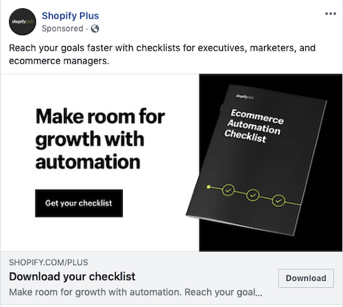
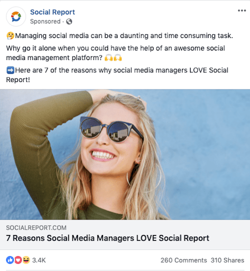
Even tech brands are getting on board with the appeal of lifestyle images:

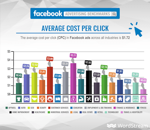
Even if your industry has a low CTR, it’s important to look at average cost per click (CPC) to get the full picture. For example, even though insurance-related content has a low average CTR, its CPC is $3.77 on Facebook – that’s high for Facebook, but actually much lower than the CPC on Google, which can be as high as $50 or more.
For such industries, you’d have to improve your CTA and landing page strategy in order to make your Facebook ads worth it.
You’ll also want to consider conversion rate. For example, while employment & job training has a low average click-through rate on Facebook, the industry has a high Facebook conversion rate.
Knowing these trends can help you choose the right type of Facebook ad and CTA. In the example of employment & job training, a lead-generation ad is best. While fewer people are interested in employment & job training than, say, fitness, those who are interested are very interested and ready to take the next step.
7 Ways to Create Powerful Facebook CTAs
Your CTA is what starts building a relationship with the customer. Facebook understands this, which is why there are various CTA buttons that you can use in your ads.
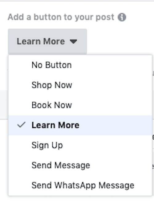
Note that the CTA options will change based on the type of business you run.
The button is only one part of your CTA. The rest of the ad has to guide the user to actually click the button, and then the landing page they’re directed to has to do more work to secure the conversion. You’ll need to put thought into all of these steps.
Also, some ads don’t have buttons. For example, the CTA in sidebar ads is the top line of text:
Here are Seven of the Best Facebook CTA Strategies to Get Your Customers to Convert
1) Appeal to Emotion
One of the most difficult techniques to master – in writing, marketing and Facebook ads – is appealing to the customer’s emotions by promoting a benefit or solution. Many companies promote a product or service by focusing on what they do or how they do it instead of why.
The customer’s emotional side is what does the buying. Money isn’t spent on features, it’s spent on solutions. Let’s look at this ad:
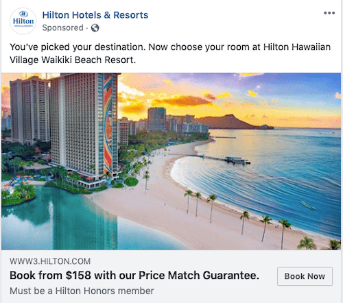
That’s a good price on a hotel in Honolulu, but the customer isn’t going to Hawaii so they can spend $158 on a hotel – they’re going so they can have a quintessential Hawaiian vacation, with all of the experiences and memories that come along with it. A better version of that ad would put the price in smaller letters and use the larger font for an emotion-appealing CTA like, “Stop waiting. Book your dream vacation now.”
Asking Questions
Asking a question is a quick way to tap into the customer’s emotions. When you pose a question, the reader naturally answers it. You can “trick” them into thinking about what they need before you even present your offer.
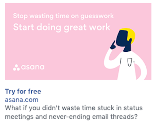
Using Negative Words
When done well, negative words can make a big emotional impact. People are often worried that they’re making the wrong choice. Appeal to that fear with words like “stop” or “don’t.” The goal isn’t to make your customer feel dumb; it’s to encourage them to improve their life by stopping A and starting B instead.
At Jumper Media
we help businesses tell their stories through Facebook Advertising.
Get in touch for a free demo.
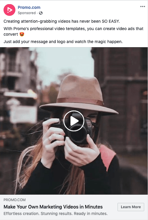
2) Start With a Verb
You want your customer to complete a specific action, and therefore your copy should be actionable. You’ll also notice that starting your sentence with a verb helps you cut down on your total words used. For example, “Shop for your next date night outfit,” is shorter than, “It’s time to shop for your next date night outfit.”
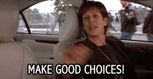
This ad is trying to be actionable, but it’s missing the mark:

“The first move takes less than 3 minutes” is appealing because it communicates that you can make progress quickly, but there’s a more powerful way to say it, like “Attack your biggest financial problem in three minutes flat.”
A quick design note about this ad, too: what does that image have to do with making smart money choices?
This is a much better ad in terms of actionability, and it has the same “in just a few minutes” appeal as the Penny Hoarder ad:
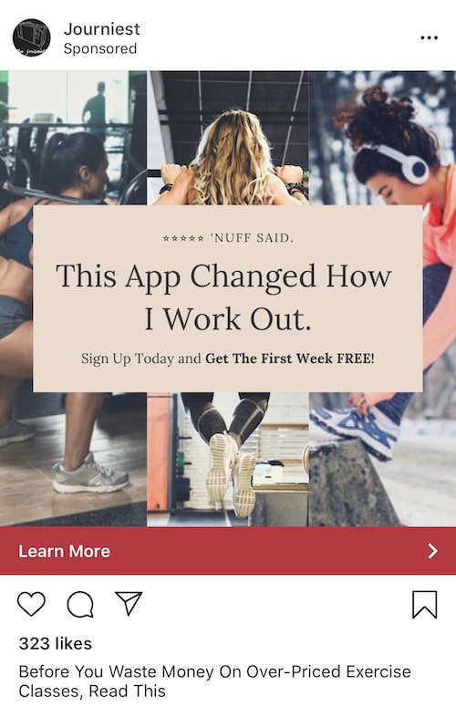
3) Create Urgency
In a world where Amazon ships in two days and every digital product can be downloaded in five seconds, creating urgency is a challenge. Enter the limited-time deal. When mixed with the idea of scarcity (“Only 10 spots left for this free webinar! Sign up now!”) and/or social proof, you can trigger FOMO (fear of missing out) in your customers. Use time-sensitive wording in your CTAs, such as:
- Act now
- Don’t miss out
- Hurry
- Last chance
- Limited time
- Only
- Rush
- Today
Play around with time frames. A week-long deal may not create enough urgency, and customers may wait until the last minute to make a purchase, if they remember to make one at all. A deal that expires at midnight is much more persuasive.
4) Harness the Power of “Free”
Things are immediately more attractive when they’re free. A free product or trial, a free upgrade, buy-one-get-one-free – “yes, please!” is the first thing that springs to the customer’s mind.
There is something to be said for creating a more difficult barrier to entry so that you know your customers are invested, but when you’re connecting with them for the first time, like through a brand awareness ad, you have to make the conversion as easy as possible. “Free” helps with that. Give something away for free, no strings attached, or make part of the sale free.
Using Numbers in CTAs
Let’s say you can’t give anything away for free. Using numbers in your CTA will weed out the people who aren’t willing or able to pay. While you may have a lower CTR than with a “free” ad, you could have a higher conversion rate because people already know what to expect once they click through.
5) Use Emojis (Maybe)
Emojis are a gray area when it comes to marketing. Some brands use them and do well with them, while others never use so much as a smiley face and look like they’re trying too hard if they ever do.
The golden rule is that if you have a brand voice that’s casual and emoji-friendly, try some out in your marketing. They can mix up the appearance of a post and add extra texture:
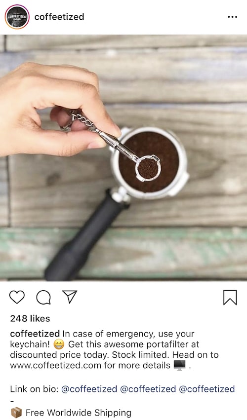
6) Add Social Proof
People are often afraid to make a purchase because they worry that they’ll waste their money, time or both. When a product or service is being given away for free, there’s less fear, but even wasting time feels too risky to some people.
Social proof can help combat some of this fear by communicating, “Look, other people have done it!” The easiest way to work social proof into your Facebook is by mentioning how many others have downloaded an e-product or signed up for a membership.

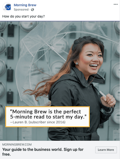
Even better is if you can add a testimonial from an influencer:

This was an Instagram post, not an ad, but you can easily turn a post like this into an ad and include a CTA button.
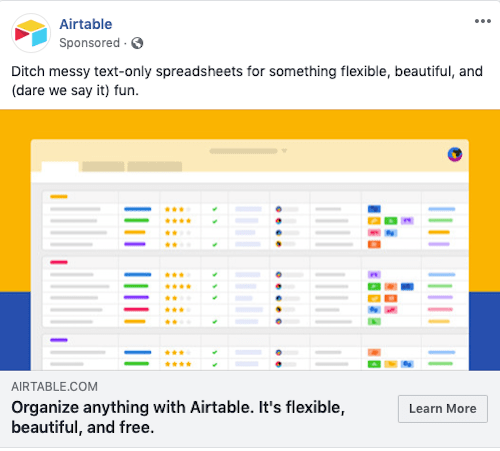
7) Keep it Concise
Your CTA should be short and clear. It may be the only part of the ad that the customer looks at, and it needs to quickly convey what you’re offering and what they have to do to get it.
This ad is missing the CTA button I think it needs, but it’s a good example of a concise CTA that checks all the right boxes:
A Note About Landing Pages
There are all sorts of design hacks and CTA tips for creating a landing page, and that info could fill its own article. What’s most important to know regarding Facebook CTAs and the landing page they direct customers to is that the information has to be consistent.

If you can get someone to follow through with the CTA, it’s because they like what you’re saying – so your landing page has to keep saying that same thing. Use the same or similar images and wording on the landing page, and go a bit more in-depth regarding the benefits of taking the next step.
Testing Different CTA Buttons
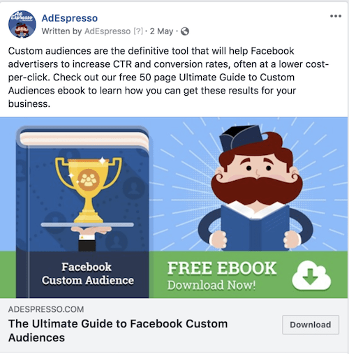
AdEspresso ran a simple four-way Facebook ads test to see which button type worked best with the same ad. They tested the ad with three buttons – Learn More, Download and Sign Up – and also with no button. You can read about the experiment here, but here’s a recap of what they discovered:
- The results showed that “Download” performed best in terms of impressions, clicks and conversions, and that it had the lowest CPC.
- AdEspresso believes that “Download” worked so well because the rest of the ad gave enough information to help the user make a decision.
- “Learn More” and “Sign Up” may have been less enticing because they’re believed to be more time-consuming – “Learn More” means “read more,” and “Sign Up” may require personal information and a credit card.
- Having no CTA button increased CPC by almost 2.5x. Any button is better than no button.
While “Download” won’t be the perfect button to use on any ad or for any industry, it’s a good example of how thorough copy matched up with the right CTA attracts people at a specific stage of the marketing funnel.
In e-commerce, the “Purchase” button may work well because people are already expecting to make a payment.
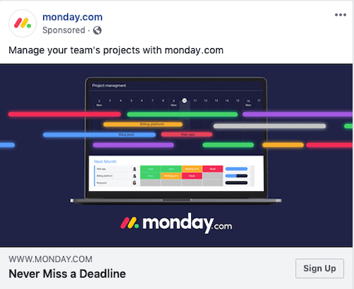
With an interesting or complex topic, “Learn More” could be exactly what the customer wants to do. For example, in this ad from Monday.com, “Sign Up” is too much too soon – I want to learn more about what they can do for me, what it costs, etc. before investing my personal information and money into it.
When testing these choices, eliminate the variables that you’re not testing. For example, if you want to find out if the “Learn More” button is more powerful than the “Sign Up” button, everything else in the ad should remain the same (wording, images, budget, placement, etc.).
Choose the Appropriate CTA For Your Businesses Facebook Ad
Even the best graphic designers and copywriters can’t improve CTR and conversion rates if the CTA is lacking. It’s always smart to test out different CTA strategies until you find the ones that work for your company, industry and audience.
Once you feel like you have a solid strategy in place, you can begin testing other components of your ad to see if results improve even more.